Saturday, 28 April 2012
Friday, 20 April 2012
Front & Middle Cover Process
My group and I are currently working on creating and developing our ancillary tasks. The following pictures on the left-side are the front & middle cover in development for our album, therefor they are currently the unfinished products. We have already finished doing our photo shoots and were all very happy with the photos that have come out. We have choose that our theme will be Punk Prom Style and showing that I have been cheating, and asking people not to reveal my secret. Therefor we came up with the idea as for the album to be called 'Secrets', in the front cover there will be a photo of me sat on the wall, putting on an evil smile, therefor making people wonder what the secret is about.

The middle cover, is about me in a relationship with a boy, but cheating on him with someone else. Therefore, when the audience opens the album, they will understand what everything is about. We think this works very well with our music video, hence the whole story is about cheating. We choose the tag line to be 'If you love two people at the same time, choose the second.. because if you loved the first one, you wouldn't have fallen for the second.' The back cover for our album is currently still in development and we didn't manage yet, to put up evidence on the blog about it.
Thursday, 22 March 2012
Storyboard
The following drawings are the story boards for the final piece of our music video which our group has created in order for us and the audience to understand what we are after in the music video. This story board allows us to see the different camera angles and types of shots we are after and to show what we aim for.
Here is the storyboard for the ending of our music video.
Saturday, 17 March 2012
Anthem Beatz Records up on Facebook.
We believe the internet is a place where everyone is able to share their thoughts and opinions on something. Because of this we decided to create a group on facebook, and add members who can leave feedback's and comments about everything Anthem Beatz Record's does.
Friday, 16 March 2012
CD Cover Inspiration.
After the amount of research we have done on the similar genre artists, in order to get an idea of what our CD Cover Artwork should look like we have found some inspiration for our artwork. When we have analysed CD Covers from our genre we discovered that they were quite funky and simple. To not break the codes and conventions of our genre, we want to be creative and simple with our CD Cover and Poster, and make them look Punk/Pop-Rock style and using Adobe Photoshop to edit them with. Below are a couple of existing CD Covers from a different genre artist, to ours that we looked at and would like to make our cover look similarly the same, but to add more of a rock theme because the 'Taylor Swift' & 'Jessica Simpson' one look more of a alternative country style theme. 'Selena Gomez and The Scene' album cover looks, much similar as the one we are thinking to create, because of the dark make up, and the rock style denim jacket she is wearing and the dark background.
When You're Gone Lyrics Analysis.
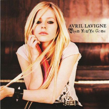
Below you can find the lyrics to our chosen song, 'When You're Gone' The main framework to this song is about being with someone you love, and you have to say goodbye, and all the little things you miss about them. The lyrics are quite upsetting and filled with sadness and heartbreak. So after doing this research, we decided that in our music video, we will keep the theme quite dark and heartbreaking, despite the fact that there will be a large amount of performance.
I always needed time on my own
I never thought I'd need you there when I cry
And the days feel like years when I'm alone
And the bed where you lie is made up on your side
When you walk away I count the steps that you take
Do you see how much I need you right now?
When you're gone
The pieces of my heart are missing you
When you're gone
The face I came to know is missing too
When you're gone
The words I need to hear to always get me through
The day and make it ok
I miss you
I've never felt this way before
Everything that I do reminds me of you
And the clothes you left, they lie on the floor
And they smell just like you, I love the things that you do
When you walk away I count the steps that you take
Do you see how much I need you right now?
When you're gone
The pieces of my heart are missing you
And when you're gone
The face I came to know is missing too
And when you're gone
The words I need to hear to always get me through
The day and make it ok
I miss you
We were made for each other
Out here forever
I know we were, yeah
And all I ever wanted was for you to know
Everything I'd do, I'd give my heart and soul
I can hardly breathe I need to feel you here with me, yeah
When you're gone
The pieces of my heart are missing you
And when you're gone
The face I came to know is missing too
And when you're gone
All the words I need to hear will always get me through
The day and make it ok
I miss you
I always needed time on my own
I never thought I'd need you there when I cry
And the days feel like years when I'm alone
And the bed where you lie is made up on your side
When you walk away I count the steps that you take
Do you see how much I need you right now?
When you're gone
The pieces of my heart are missing you
When you're gone
The face I came to know is missing too
When you're gone
The words I need to hear to always get me through
The day and make it ok
I miss you
I've never felt this way before
Everything that I do reminds me of you
And the clothes you left, they lie on the floor
And they smell just like you, I love the things that you do
When you walk away I count the steps that you take
Do you see how much I need you right now?
When you're gone
The pieces of my heart are missing you
And when you're gone
The face I came to know is missing too
And when you're gone
The words I need to hear to always get me through
The day and make it ok
I miss you
We were made for each other
Out here forever
I know we were, yeah
And all I ever wanted was for you to know
Everything I'd do, I'd give my heart and soul
I can hardly breathe I need to feel you here with me, yeah
When you're gone
The pieces of my heart are missing you
And when you're gone
The face I came to know is missing too
And when you're gone
All the words I need to hear will always get me through
The day and make it ok
I miss you
Monday, 12 March 2012
Small Changes.
During Thursday afternoon while me and my group decided to return to the classroom to work on some editing, my media teacher who taught us at AS Level, decided to come over and check the process of our music video. While she was watching what we have created so far, she believed our narrative shots didn't really relate together, and gave us a much better idea that we can use, using the same story line we picked but develop it in a less complicated way. So in our old narrative, where we had the two different story lines: Gabby's & Niall's story (Gabriella Cotton and Niall Corish) (Acting as girlfriend & boyfriend) fighting because the boyfriend cheated on her with another girl. And Holly's story (Holly Cantle), a young teenager crying over the death of her best friend. Our teacher's idea was to, try and relate the stories together such as use Holly to be the girl, Niall is cheating on Gabby with. Unfortunately, due to small major reasons, Holly wasn't up for playing this part, so I talked to a very close friend of mine and she said she would play this part. Our narrative so far is very similar to the old one, Gabby finds out that the boy she is engaged to is cheating on her with another girl called Lauren (Lauren Gage).
Saturday, 18 February 2012
Poster Analysis.
One other thing that belongs to our Digi Pack, is to create a poster in order to advertise the release of our CD and Music Video. I have looked at a few posters from artists of the similar genre, to analyze them and get inspiration from.
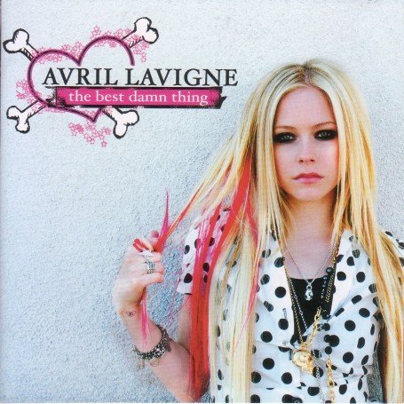
Avril Lavigne- The Best Damn Thing (2007)
P!nk- I'm Not Dead (2006)
Avril Lavigne- The Best Damn Thing (2007)
This is a poster advertising the release of Avril Lavigne's 2007 album 'The Best Damn Thing'. The image is the same as the one she has on the album. This poster is very simple, with Avril in a mid-shot with a simple grey background, and her name, and the name of the album printed on the top left hand corner with a very punky pink heart in the background. The overall theme of the artwork is kept the same in terms of fonts.
Maroon 5 -Hands All Over Me (2011)
This advertisement poster by Maroon 5 is pretty easy to create. Its in black and white with slight bits of red in it to make the title stand out a little bit better. It features a simple black and white image of the band itself, that cannot be found on the album itself. It advertises a concert the band will be having in the specific place at the specific time to be able to promote their new album 'Hands All Over Me' with the album artwork and few of the singles that can be found on the album showed on the poster. The plain white font is set on the image which comes across as quite effective with this style of artwork. Maroon 5 -Hands All Over Me (2011)
P!nk- I'm Not Dead (2006)
I find this poster to be very creative because of the use of the colors and images, and the pose P!nk does.I like the roses in front of the image because it also matches the red-white striped shirt she is wearing and makes the poster stand out. The font below it titling the name of the album, which comes across as quite effective The image that is featured on this poster, can actually be found on the exact album itself. Pink said she titled the album 'I'm Not Dead' because ''its about being alive and feisty and not sitting down and shutting up even though people would like you to'.
Thursday, 9 February 2012
CD Cover Analysis.
In preparation for our ancillary tasks, our next step for this project is to start analyzing CD Covers and Posters of our similar genre. I have decided to analyse three CD Covers from three artists with the similar genre of POP/POP-ROCK music.
Avril Lavigne-Goodbye Lullaby (2011)
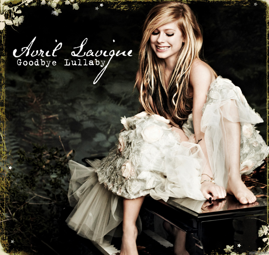
This is the album cover for Avril Lavigne's 2011 release for Goodbye Lullaby. I shall start analyzing the mise-en-scene of this album, and as we can see Avril is led on a black piano dressed in a white long dress which signifies innocence and purity, also covered in cream colored flowers around her. Her makeup and hair look messy, (typical pop-rock style) and the back ground of this cover is green, which with the help of a software such as Photoshop looks like a forest covered in green plants. What I really like about this cover is that it’s got a very different style using a background which looks out into a forest, rather than a plain colored background. Another thing I admire about this cover is Avril in her white dress led on the black piano, looking very innocent and upset. The CD cover is looking pretty simple with what looks like a black and white effect, with Avril in white a dress sitting on the floor looking upset. The Back Cover of the album has the similar background to the Front Cover, the only difference is Avril sitting in a different position on the piano with her focus to the camera in a Mid-Shot/Medium Close-Up.
This is the album cover for Florence and The Machine's 2009 release for Lungs. I choose this cover because I think it stood out, and it represents the band and the album really well. The image on this cover is colorful, but they have used subtle simple colors which made it look quite a cold image. Another thing I also like about this cover is that they used a pair of lungs on her, to fit with the title of the album. I like it how she is posing against the tree covered up with flowers around her. This image sums up the band, because I think they are more of a rock indie genre, and this image really shows that, compared to how a rock band would have they're image presented. The title of the band is presented on the top and even the style font matches the cover as it is white and the writing is flowed and isn't block letters like the album's title written at the bottom. I like the way they have chosen to place the album's title on her body over the lungs because it is focusing on the lungs which the audience will notice and want to look at more, as it would be interesting to see why they have called the album 'Lungs' and actually have lungs shown on the cover.
Avril Lavigne-Goodbye Lullaby (2011)
This is the album cover for Avril Lavigne's 2011 release for Goodbye Lullaby. I shall start analyzing the mise-en-scene of this album, and as we can see Avril is led on a black piano dressed in a white long dress which signifies innocence and purity, also covered in cream colored flowers around her. Her makeup and hair look messy, (typical pop-rock style) and the back ground of this cover is green, which with the help of a software such as Photoshop looks like a forest covered in green plants. What I really like about this cover is that it’s got a very different style using a background which looks out into a forest, rather than a plain colored background. Another thing I admire about this cover is Avril in her white dress led on the black piano, looking very innocent and upset. The CD cover is looking pretty simple with what looks like a black and white effect, with Avril in white a dress sitting on the floor looking upset. The Back Cover of the album has the similar background to the Front Cover, the only difference is Avril sitting in a different position on the piano with her focus to the camera in a Mid-Shot/Medium Close-Up.
P!nk- Funhouse (2008)
This is the album cover for Pink's 2008 release for Funhouse. I like this imagine because its fun looking and quite punky, it also has Pink in it and she shows that she is having a really good time, as if she doesn't care about anything, which is also quite rebellious. Yet this image is quite child like, as it has a carousel horse which she seems to be riding. Pink's outfit looks like a circus costume which also fits in with the title 'funhouse'. The font in the background is very circus like as well. I think this image is showing her genre style of music is pop, but quite rocky as she doesn't come across as being the typical pop artist. The CD cover is similar alike, with Pink riding a carousel horse wearing a long pink dress with colorful balloons around her. The back cover of the album, has different font style of credits, more circus like in the black colour. Pink is sat on what seems its a sandy beach looking straight at the camera with trumpet next to her.
Florence and The Machine- Lungs (2009)
This is the album cover for Florence and The Machine's 2009 release for Lungs. I choose this cover because I think it stood out, and it represents the band and the album really well. The image on this cover is colorful, but they have used subtle simple colors which made it look quite a cold image. Another thing I also like about this cover is that they used a pair of lungs on her, to fit with the title of the album. I like it how she is posing against the tree covered up with flowers around her. This image sums up the band, because I think they are more of a rock indie genre, and this image really shows that, compared to how a rock band would have they're image presented. The title of the band is presented on the top and even the style font matches the cover as it is white and the writing is flowed and isn't block letters like the album's title written at the bottom. I like the way they have chosen to place the album's title on her body over the lungs because it is focusing on the lungs which the audience will notice and want to look at more, as it would be interesting to see why they have called the album 'Lungs' and actually have lungs shown on the cover.
Subscribe to:
Posts (Atom)